Action Wine
No Guts, No Glory
services


After 15 years in the game, Action Wine came to ENC ready to scrap the snooty undertones and build something real. Something with grit. Something with guts. The wine world's tired tropes had no place here, and the old identity wasn't doing justice to a brand built on effort over ego.


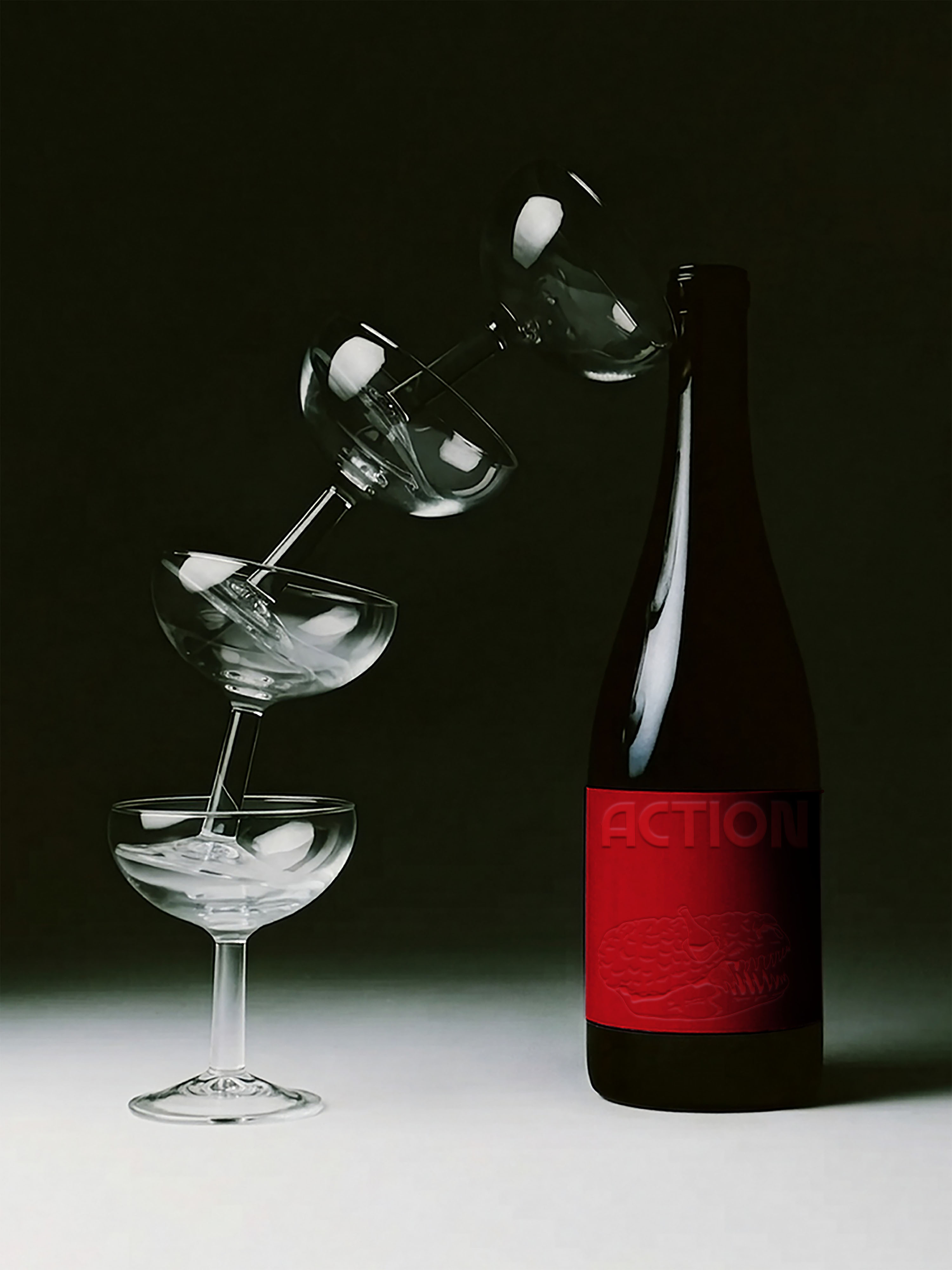
We delivered a bold new identity that threw out the rustic clichés and leaned into raw energy, movement, and edge. A dynamic logo family, a color palette that hits like a glass of something strong, and yes, the now-iconic Gila monster brand mark. A twisted idea that started as a joke in the first meeting and ended up becoming the perfect symbol of their chaos-meets-craft ethos.
It's weird. It works. It's Action. Every detail was designed to feel alive, because when your whole brand is built on effort over ego, your look better show up swinging. This one does.